日本のガラパゴス症候群 Vol.7(The Global Competitiveness Report 2016–2017 - 国際競争力ランキング2016)

All the below links are in English. Excerpts, et al. are on our own. You can check out methodology as well.

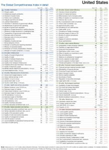
The Global Competitiveness Report 2016–2017 (w PDF) | @wef のPDFのうち、Europe、East Asia and Pacific、North Americaに係る掲載文の抜粋等です。一番最後の私見もご覧ください。

Europe
box5-brexit
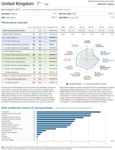
Faced with impending Brexit and geopolitical crises spilling over into the region, Europe finds itself in critical condition in many respects. Nevertheless, the region — which includes the EU28, Iceland, Norway, Switzerland, the Balkans, and Turkey — still performs above the global average in terms of competitiveness (4.72 average score in Europe versus an average score of 4.11 among the rest of the world). This is driven by the performance of a group of regional champions, notably Switzerland, which leads the global rankings for the eighth consecutive year. The top 12 includes seven more European countries: the Netherlands (4th), Germany (5th), Sweden (6th), the United Kingdom (7th), Finland (10th), Norway (11th), and Denmark (12th).
uk-p1uk-p2
figure8-europe
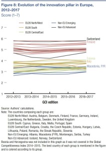
… there is wide dispersion in regional performance on several pillars. The largest gap is in the macroeconomic environment pillar, a reflection of the fact that the region has been recovering unevenly from the global financial crisis. Europe’s median performance is weakest across the innovation indicators: Figure 8 shows that the region’s countries are clearly divided, with a significant gap between the innovation assessment for Northern and Western European countries versus Central, Eastern, and Southern European ones. Although this gap has been a persistent challenge, there are some recent encouraging signs of convergence in certain dimensions.
ireland-p1ireland-p2
Accelerating innovation efforts will be crucial to maintain current levels of prosperity, and Europe can expect high returns from focusing its resources on nurturing its talent. … On attracting and retaining international talent, although one European country (Switzerland) achieves the top global scores, the average for the region as a whole is low; this does not bode well for the creation of a vibrant European knowledge economy. The United Kingdom is currently still the most attractive EU destination for talent, yet the Brexit vote has created significant uncertainty over the conditions under which workers from EU countries will be able to participate in the UK economy in the future. Moreover, university applications from the European Union could potentially drop amid uncertainty over prospective students’ status and subsequent access to the UK job market (see Box 5 on the potential implications of Brexit; note that data presented in the Report were collected before the Brexit vote). … some of the largest score drops for France compared to last year were registered for the “attract and retain talent” indicators.
… Yet good practice examples in this area exist on the continent, with countries such as Switzerland and Denmark striking a balance between high labor market flexibility and strong social safety nets. …

East Asia and Pacific
japan-p1japan-p2
East Asia and Pacific is characterized by great diversity. The region’s 18 economies covered in the GCI 2016–2017 span a large part of the development ladder, from Cambodia to Singapore, and include three of the world’s 10 largest economies: China, Japan, and Indonesia. The region’s emerging economies, led by China, have been supporting the modest global recovery since the global financial crisis. These economies accounted for almost two-fifths of global growth last year, more than twice the combined contribution of all other emerging regions. Today, global economic prospects look less favorable as a result of China’s slowdown, anemic growth in Japan and other advanced economies, and persistently low commodity prices undermining the growth and public finances of several economies in the region — notably Indonesia and Mongolia.
nz-p1nz-p2
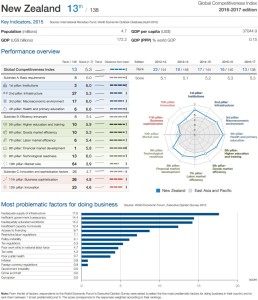
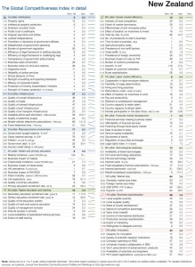
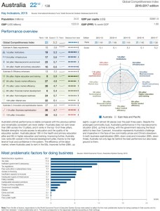
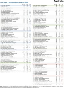
The GCI results reveal contrasts in the region. Its advanced economies continue to perform strongly. Led by Singapore, 2nd overall behind Switzerland for the sixth consecutive year, these economies all feature in the top 30 of the GCI rankings. Losing ground since last year, Japan ranks 8th (down two) and Hong Kong SAR ranks 9th (down two). New Zealand advances three positions to 13th, while Chinese Taipei is up one notch to 14th. Further down, Australia (22nd) and the Republic of Korea (26th) both improve their scores but their positions are unchanged.
Among emerging economies, Malaysia (25th) continues to lead the region, despite losing some ground this year following six years of improvement. China remains steady at 28th for the third year in a row.
australia-p1australia-p2
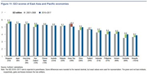
Reflected in the evolution of the GCI score since the 2007–2008 edition, the overall competitiveness trends for the region are overwhelmingly positive: 13 of the region’s 15 economies covered since 2007 achieve a higher score today, with Cambodia, China, and the Philippines posting the largest gains (see Figure 11). The only exceptions are Korea and Thailand, though for the latter the loss has been small and from a high base. …
figure11-easiapacific
The region’s advanced economies need to further develop their innovation capacity. Japan and Singapore are the only economies in the region among the world’s top 10 innovators, ranking respectively 8th and 9th in the innovation pillar. Japan, Korea (which has dropped from 8th to 20th in the pillar since 2007), and to a lesser extent Chinese Taipei (11th), have experienced a steady erosion of their innovation edge since 2007. Meanwhile New Zealand (23rd), although it has improved significantly since 2007, Australia (26th), and Hong Kong (27th) remain far behind the world’s innovation powerhouses.
Since 2007, most emerging economies have improved on the basic drivers of competitiveness (i.e., on the first four pillars of the GCI) — often markedly, though also often from a low base. With the exception of Malaysia and Thailand, these economies have made major strides in improving governance, including in tackling corruption. All of them except Thailand have also made significant progress in terms of transport infrastructure… A similar generalized upward trend is seen in health and basic education. … On the macroeconomic front, the situation has also improved almost everywhere, with inflation at a 10-year low in most economies. The fiscal situation is also relatively sound, with most economies posting deficits lower than 3 percent. The notable exception is Mongolia, where the macroeconomic situation remains worryingly volatile. …

North America
figure16-namerica
The United States ranks 3rd for the third consecutive year, while Canada ranks 15th. However, the evolution of how the two countries rank on various pillars sheds light on the forces shaping competitiveness among advanced economies at the forefront of the Fourth Industrial Revolution.
canada-p1canada-p2
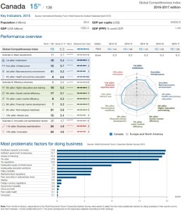
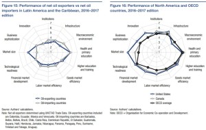
Both the United States and Canada outperform the Organisation for Economic Co-operation and Development (OECD) country average overall and on most pillars, although the OECD average beats the United States in areas such as macroeconomic performance and health and primary education (Figure 16). The United States lags behind Canada in the quality of institutions, macroeconomic environment, and health and primary education. Canada’s largest disparities with OECD countries are in business sophistication and innovation. The large domestic market in the United States represents a major source of competitiveness advantage over other advanced economies.
us-p1us-p2
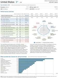
Since 2007, the United States has been falling behind both in absolute and relative terms in infrastructure, macroeconomic environment, and goods market efficiency. It has improved, however, on health and primary education, higher education and training, and especially technological readiness, one of the most essential pillars for taking advantage of new technologies.
Canada, on the other hand, has improved marginally in all efficiency enhancers, with markets for goods, labor, capital, and human capital remaining among the best-ranked of the OECD countries. However, Canada lags behind on innovation and business sophistication, which are especially central for advanced economies.
In the United States, innovation and business sophistication have improved; in Canada, they have deteriorated and could be slowing down productivity improvements. However, the business community in the United States is increasingly concerned about basic determinants of competitiveness such as infrastructure.

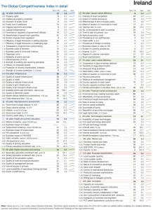
私見:ランク自体に一喜一憂するのは無意味ですが、ご指摘のとおりという面もあると感じます。日本の課題は、1st pillar: Institutions(ランク16位、スコア5.4)、3rd pillar: Macroeconomic environment(104位、4.1)、5th pillar: Higher education and training(23位、5.4)、6th pillar: Goods market efficiency(16位、5.2)、7th pillar: Labor market efficiency(19位、4.8)、8th pillar: Financial market development(17位、4.9)、9th pillar: Technological readiness(19位、5.8)に共通して、技術の発展、国内外の経済の連動性、資本主義・民主主義下での経済活動の積み重ねなどにより表れる時代背景に合わない、無駄な作業の多さ、効率の悪さ、機会の不平等、形式主義などを社会慣行・固定観念として引きずってしまっていることではないかと感じています。『日本のガラパゴス症候群』と若干激しいタイトルを付けたのも、この感触に基づきます。公債残高はすぐにはどうしようもないので 3rd pillar は今後も低迷し続け総合ランクにも負の影響を与え続けますが、efficiency や fundamental human rights さらには public welfare を総合考量的に尊重する方向に行けば、各pillarのスコアは上がり日本企業は強くなり日本国民の満足度は増して行くと考えます。ここ何年か同じ顔ぶれの、スイス(総合ランク1位)、シンガポール(2位)、アメリカ(3位)などが参考になるはずです。

ツイッター paper.li Vol.8

All the below links are in English.

弊社ツイッターアカウントの一つ @WSjp_insight のRTによる paper.li 掲載記事4件を貼っておきます。

National raw materials agreement to foster circular economy by 2050 | @MinInfraEnvirNL

Rising Irish property prices threaten stability, @OECD warns | @IrishTimes @BRegsBlog

3 Unexpected Fish Species Found in the Inland Bays | @DEInlandBays

Sen. President Sweeney calls Christie’s tax deal nix with Pa. ‘horrible’ | @Trentonian

日本のガラパゴス症候群 Vol.6(TimesHigherEducation World University Rankings 2016-2017 -THE世界大学ランキング2016)

The below three links (1.~3.) are in English.

the-world-university-rankings-2016-2017-methodology-small

以下、英語抜粋等です。日本人が英語圏の大学や研究機関に人的に入り込めれば、研究は評価され順位は上がる等となります。アジア何位かは考えず、日本が持っている素晴らしい研究成果をいかに評価させるかに執念を燃やし、どんどん人的に英語圏に入っていくことに弊社も微力ながらお手伝いできると考えております。4.は日本語です。

1.  World University Rankings 2016-2017: results announced (September 21, 2016) | @elliebothwell @THEworldunirank @timeshighered

… Overall, 289 Asian universities from 24 countries make the overall list of 980 institutions and an elite group of 19 are in the top 200, up from 15 last year.

When analysing which countries achieve the highest average scores, Singapore comes top on all five of the pillars underlying the ranking – teaching, research, citations, industry income and international outlook. Hong Kong is second for teaching, third for research and fourth for citations.

Rajika Bhandari, deputy vice-president of research and evaluation at the Institute of International Education and co-editor of the book Asia: The Next Higher Education Superpower?, said that the “sharp rise” of Asia’s universities is due to three main factors: rapidly growing populations and demand for higher education in the region; governments making “significant investments” in universities; and improvements by individual institutions.

On advances at university level, she said that many Asian scholars who studied at Western universities are now academics in their home countries and have “really begun to transform their own higher education sectors”.

They have “brought back to [their] home campuses some of the teaching values of critical thinking and liberal education, as well as the idea of promotion based on merit and research outputs”, she said.

She predicted that there will be continued expansion of cross-degree and campus partnerships among institutions in Asia and the West, as well as a “huge push towards intra-regional higher education partnerships and mobility within the Asia-Pacific region”.

However, Richard Robison, emeritus professor in the Asia Research Centre at Murdoch University (@MurdochUni), said while there are a “small number” of Asian universities “making international strides”, many are much further behind.

When asked whether he envisioned some Asian universities competing with the likes of Oxbridge and the Ivy League, he said: “I can’t see them becoming giant intellectual hubs that some big Western universities have become over a couple of hundred years because they have a different idea about education and a different way of going about it.”

He said that Asian universities create a “very pressured environment”, have “a lot of learning by rote” and there is “not a lot of discussion in classes”.

I don’t know if that would translate globally, except in some of the narrow scientific and technical areas,” he said.

2.  World University Rankings 2016-2017: Standing still is not an option (September 21, 2016) | @phil_baty @THEworldunirank @timeshighered

… In 2004, our ability to support the higher education community advanced when we became one of the world’s first organisations to publish a global university ranking. …

In 2010, our world rankings were dramatically enhanced when, after almost a year of open consultation with the global community, we delivered a much more comprehensive version of the THE World University Rankings. We employed for the first time our current balanced range of 13 performance indicators, introducing new metrics for teaching and knowledge transfer in addition to research excellence. …

The Times Higher Education World University Rankings 2016-17 – our 13th annual publication – lists 980 institutions from 79 countries. Last year, we ranked 801 universities from 70 countries, up from only 400 universities in 2014. This year, we were able to draw on a database with tens of thousands of data points on 1,313 of the world’s leading research-intensive universities, compared with the previous year’s total of 1,128 institutions.

This year, we can draw on more than 20,000 responses to our annual academic reputation surveys – 10,323 responses, from 133 countries, to the 2016 survey combined with the 10,507 from last year. This year, through our partner Elsevier (@ElsevierNews), we are also able to examine 56 million citations to 11.9 million publications published over the five years to 2015. Last year, we examined 51 million citations from 11.3 million publications.

Although the overall rankings methodology is the same as last year – we have further enhanced the analysis this time by including books among the research outputs we evaluate, in addition to journal articles, reviews and conference proceedings. Some 528,000 books and book chapters are included for the first time, giving a richer picture of the global research environment.

This year, in another pioneering move, our calculations have been audited by PricewaterhouseCoopers (@PwC_LLP). …

3.  World University Rankings 2016-2017 methodology (September 5, 2016) | @THEworldunirank @timeshighered

… The performance indicators are grouped into five areas:

  • Teaching (the learning environment)
  • Research (volume, income and reputation)
  • Citations (research influence)
  • International outlook (staff, students and research)
  • Industry income (knowledge transfer)

Data collection
Institutions provide and sign off their institutional data for use in the rankings. On the rare occasions when a particular data point is not provided we enter a low estimate between the average value of the indicators and the lowest value reported: the 25th percentile of the other indicators. By doing this, we avoid penalising an institution too harshly with a “zero” value for data that it overlooks or does not provide, but we do not reward it for withholding them.

Getting to the final result
… For all indicators except for the Academic Reputation Survey we calculate the cumulative probability function using a version of Z-scoring. The distribution of the data in the Academic Reputation Survey requires us to add an exponential component.

Teaching (the learning environment): 30%

  • Reputation survey: 15%
  • Staff-to-student ratio: 4.5%
  • Doctorate-to-bachelor’s ratio: 2.25%
  • Doctorates-awarded- to-academic-staff ratio: 6%
  • Institutional income: 2.25%

Research (volume, income and reputation): 30%

  • Reputation survey: 18%
  • Research income: 6%
  • Research productivity: 6%

Citations (research influence): 30%

Our research influence indicator looks at universities’ role in spreading new knowledge and ideas.

We examine research influence by capturing the number of times a university’s published work is cited by scholars globally. This year, our bibliometric data supplier Elsevier examined more than 56 million citations to 11.9 million journal articles, conference proceedings and books and book chapters published over five years. The data include the 23,000 academic journals indexed by Elsevier’s Scopus database and all indexed publications between 2011 and 2015. Citations to these publications made in the six years from 2011 to 2016 are also collected. …

International outlook (staff, students, research): 7.5%

  • International-to-domestic-student ratio: 2.5%
  • International-to-domestic-staff ratio: 2.5%
  • International collaboration: 2.5%

Industry income (knowledge transfer): 2.5%

A university’s ability to help industry with innovations, inventions and consultancy has become a core mission of the contemporary global academy. This category seeks to capture such knowledge-transfer activity by looking at how much research income an institution earns from industry (adjusted for PPP), scaled against the number of academic staff it employs. …

4.  THE世界大学ランキング2016 (2016年9月22日) | @ReseMom (Japanese)

「教育」「研究」「論文被引用数」「産業界からの収入」「国際性」を評価する13の指標をもとに各大学をランク付け・・・

Canada カナダ Vol.4

(All the below links are in English.)

Household Indebtedness and Financial Vulnerability (PDF, 19 January 2016) | @PBO_DPB 国民家計の負債と金銭的脆弱性 | カナダ連邦議会予算官(Parliamentary Budget Officer)本文抜粋・一部抄訳です。

Executive Summary 〔抜粋excerpts〕

The indebtedness of Canadian households continues to trend higher. In the third quarter of 2015, total household debt (i.e., credit market debt plus trade payables) reached 171 per cent of disposable income. In other words, for every $100 of disposable income, households had debt obligations of $171. This is the highest level recorded since 1990.
• Among G7 countries, Canada has experienced the largest increase in household debt relative to income since 2000. Households in Canada have become more indebted than any other G7 country over recent history.
• Measured relative to household assets, household debt has moderated in recent years. In the third quarter of 2015, household debt accounted for 17.0 per cent of household assets. But this was still above the average of 15.4 per cent prior to the global financial crisis.
• Analysis conducted at the Bank of Canada suggests that low interest rates, higher house prices and financial innovation have contributed to the increase in household indebtedness.
(カナダ国民の家計の負債は、引き続き高い。2015年第3四半期には、家計負債合計(即ち、クレジット市場の負債及び買掛金)は可処分所得の171%に達した。
・2000年以来、カナダはG7最大の対収入比家計負債率の伸びを示し、G7最大の家計負債国となっている。
・対家計資産比家計負債は緩やかに収束し、2015年第3四半期には家計負債は家計資産の17.0%となっている。しかし、依然として、世界金融危機前の平均である15.4%を上回っている。
・カナダ中央銀行の分析は、低金利、住宅価格高、金融技術革新が家計負債増に寄与していることを示唆している。)
…  see Summary Figure 1 (Household debt service ratios)
Based on PBO’s November 2015 Economic and Fiscal Outlook, we project that household debt will continue to rise, reaching 174 per cent of disposable income in late 2016, before returning close to current levels by the end of 2020.
Household debt-servicing capacity will become stretched further as interest rates rise to “normal” levels over the next five years. By the end of 2020, the total household DSR, that is principal plus interest, is projected to increase from 14.1 per cent of disposable income in the third quarter of 2015 to 15.9 per cent.
(家計負債は増え続け、2016年の終盤には可処分所得の174%に達し、2020年末までに今のレベルに近付くであろうというのが、2015年経済金融概観に基づく議会予算官の予測である。次の5年に亘って金利が”通常”のものになるにつれ、金利支払い(service)も引っ張られて伸びるだろう。2020年末には家計のDSR(debt service ratio: see 本文4.)は2015年第3四半期の対可処分所得比14.1%から15.9%に増える見通しである。)
household-debt-service-ratios

Based on PBO’s projection, the financial vulnerability of the average household would rise to levels beyond historical experience.
• The projected increase in the total DSR to 15.9 per cent would be 3.1 percentage points above the long-term historical average of 12.8 per cent (from 1990Q1 to 2015Q3). It would also be almost one full percentage point above its highest level over the past 25 years, 14.9 per cent, which was reached in 2007Q4.
(連邦議会予算官の予測に基づくと、平均的な家計の金銭的脆弱性はカナダ史上経験したことの無いレベルまで上がることとなる。
・上記DSR増は(1990年第1四半期から2015年第3四半期までの)平均である12.8%を3.1%更に上回っている。また、史上最高だった2007年第4四半期の14.9%を1%上回ってもいる。)

[本文・抜粋excerpts]
1. Introduction
Section 2 examines trends in household indebtedness since the early 1990s. Section 3 incorporates household assets into the analysis and examines the evolution of household debt relative to assets. Section 4 presents and discusses trends in household debt-servicing capacity. The concluding Section 5 presents a medium-term outlook for household debt and debt-servicing capacity based on PBO’s November 2015 Economic and Fiscal Outlook.

2. Household Debt
Statistics Canada identifies four major sources of household debt:
1. mortgages,
2. consumer credit,
3. non-mortgage loans and
4. trade accounts payable.
Mortgages are loans for the purchase of homes. Consumer credit includes loans for the purchase of consumer goods and other personal services, for example, a car loan or credit card debt. Non-mortgage loans are loans not intended for the purchase of consumer goods or personal services, for example, a loan to purchase securities. Finally, trade payables are short-term credit received in the ordinary course of business by suppliers of business goods and services.
Since 1991, household debt has increased each quarter, on average, by almost 7 per cent on a year-over-year basis, with the sharpest acceleration occurring over 2002 to 2008 (Figure 2-1: The evolution of household debt). In the third quarter of 2015, household debt amounted to $1.9 trillion.
Over the past 25 years, the proportional breakdown of debt has remained broadly stable. On average, mortgages have represented about 63 per cent of households’ total financial obligations; consumer credit, 29 per cent; and non-mortgage loans and trade accounts payable, 8 per cent.
the-evolution-of-household-debt

Over the past 25 years, total household debt obligations relative to disposable income have almost doubled (Figure 2-2: Household debt relative to disposable income).
household-debt-relative-to-disposable-income

As interest rates have fallen, the demand for mortgage credit has increased, stimulating both house prices and household debt. The effective household borrowing rate has declined from 6.7 per cent in January 1999 to 3.1 per cent in December 2015 (Figure 2-3: Household borrowing rate).
household-borrowing-rates
Despite the increase in house prices during this period, historically-low interest rates and growth in household incomes have helped to maintain the overall affordability of mortgages close to the average level observed prior to global financial crisis (Figure 2-4: Bank of Canada index of housing affordability). Crawford and Faruqui (2012) suggested that changes to the affordability of mortgages have been a significant driver of the rise in mortgage credit since the 1990s.
Crawford and Faruqui (2012) noted that rising house prices increased total household debt levels in two ways:
1. By increasing the mortgages required for home buyers, and
2. By providing some households with more collateral for personal lines of credit (PLCs), encouraging higher consumer credit.

boc-index-of-housing-affordability

The upward trend in household indebtedness is reflected in the debt-to-income ratio in other G7 countries, based on statistics compiled by the Organisation for Economic Co-operation and Development (OECD) (Figure 2-5: Household debt-to-income ratios in G7 countries).
household-debt-to-income-ratios-in-g7-countries

3. Household assets

Total assets are divided almost evenly between financial and non-financial assets. They increased from $2.2 trillion in 1990 to $11.3 trillion (measured at market value) by the end of the third quarter of 2015 (Figure 3-1: Financial and non-financial assets of households).

financial-and-non-financial-assets-of-households

Household financial assets consist of the following four broad categories:
1. life insurance and pensions,
2. equity and investment fund shares,
3. currency and deposits, and
4. other financial assets

Non-financial assets of households consist of the following four broad categories:
1. residential structures
2. land
3. consumer durables, and
4. other non-financial assets.

As a share of non-financial assets, the proportion of land and residential structures has increased since 1990 (Figure 3-2: Composition of household assets).
composition-of-household-assets

An increase in the debt-to-asset ratio indicates that households are becoming more leveraged. Figure 3-3 (Household debt relative to household assets) shows the evolution of the debt-to-asset ratio over time. Since 1990, this measure has fluctuated between 14 per cent and 19 per cent.
household-debt-relative-to-household-assets

4. Debt-Servicing Capacity
Households that are required to devote a substantial portion of their disposable income to service their debts are vulnerable to negative income and interest rate shocks, and are more likely to be delinquent in their debt payments. Financial vulnerability is typically assessed by examining a household’s debt service ratio (DSR). Debt service ratio = Obligated debt payments / Disposable income

While the interest-only DSR has trended downward since 1990, the total DSR remained relatively stable over 1990 to 2004 but then increased sharply through 2007 (Figure 4-1: Household debt service ratios).
household-debt-service-ratios

5. Medium-Term Outlook
In PBO’s November 2015 outlook, the target for the overnight rate was projected to increase from its current level of 0.5 per cent to 3.5 per cent by the end of 2020; similarly the 10-year benchmark bond rate was projected to increase from 1.5 percent to 4.5 per cent over the same period (Figure 5-1: Interest rates).
interest-rates

Although Statistics Canada does not provide series for the remaining amortization periods, we can use the above relationship to calculate an implicit estimate that is consistent with the observed total DSR, the historical
effective interest rate and the debt-to-income ratio data (Figure 5-2: Implicit remaining amortization periods).
implicit-remaining-amortization-periods

Based on PBO’s November 2015 outlook, household debt is projected to increase from 171 per cent of disposable income in the third quarter of 2015 to a high of 174 per cent in the third quarter of 2016 (Figure 5-3: Household debt relative to disposable income). The projected increase reflects continued gains in real house prices.
However, as the Bank of Canada raises its target for the overnight rate, beginning in the fourth quarter of 2016, short- and long-term interest rates rise steadily. At the same time, real house price gains are projected to moderate. As a consequence, household debt relative to income is projected to decline gradually, falling to just below its current level; in 2020, it would average 169 per cent.
household-debt-relative-to-disposable-income

PBO projects that household debt-servicing capacity will be stretched further over the medium term as interest rates return to more normal levels. The total household DSR is projected to increase from 14.1 per cent to 15.9 per cent (Figure 5-4: Household debt service ratios = same as Summary Figure 1).
Unlike the benchmarks used by financial institutions for assessing an individual household’s financial vulnerability, a threshold for the economy-wide debt service ratio does not exist. However, to gauge the vulnerability at the aggregate level, it can be informative to compare the projected results for the total DSR to historical experience.
household-debt-service-ratios

参考

A dash of data: Spotlight on Canadian households | #OECDInsights (カナダ国民の家計 | OECD)

National balance sheet and financial flow accounts, first quarter 2016(w PDF, June 14, 2016) | @StatCan_eng (2016年第1四半期の国家貸借対照表及び国家ファイナンシャルフロー計算書 | カナダ連邦統計局)

World Vol.2(Troubled waters – the South China Sea)

Julian Lorkin’s interview with Shanghai-born Vic Edwards, a visiting fellow in the school of banking and finance at UNSW Business School and a part-time professorial visiting fellow at China Youth University of Political Studies in Beijing.

Troubled waters: Vic Edwards on the dispute in the South China Sea (w Video; August 17, 2016) | @JLorkin @UNSWbusiness
豪ニューサウスウェールズ大学や中国青年政治学院に籍を置く、上海生まれ中国系有識者のインタビュービデオ(上記link)抜粋・下線・抄訳です。

BusinessThink (@JLorkin): The Permanent Court of Arbitration’s ruling at The Hague in July has been rather coolly received, at least in China. It deals with thorny issues [of historic rights and the source of maritime entitlements] in the South China Sea, through which much of the world’s trade passes.
The question is, should Australia be worried and should China be concerned, particularly as the Chinese economy starts to cool? Let’s start with what China is calling the nine-dash line. What is the historical basis for their claims?
Vic Edwards: … So the US switched their allegiances to Japan and managed to persuade Japan to come on the side of the US, even though they were deadly enemies before that. And that was on the basis that they would save the life of the emperor, Hirohito, who was a godlike character in Japan. So by offering that as an olive branch, so to speak, Japan came onside with the US and with Great Britain in 1952.
(… 殺し合う敵だったのにアメリカが日本を同盟国に引き入れることができたのは、日本で神格化されていた天皇ヒロヒトをアメリカが救ったからだ。…)
​Over quite a long period there hasn’t been a great deal of difficulty and I think the position that China took was when you had the Permanent Court of Arbitration say that it wanted to arbitrate on the matter, China saw clearly that the international law of the sea, which they had interpreted as accepting their position of having the South China Sea, was therefore up for arbitration and dispute. Consequently, they decided not to submit themselves to the jurisdiction of the UN and the Permanent Court of Arbitration.
(中国は本件で長期間大きな困難がなく、中国は国際海洋法条約が南シナ海を有するという中国の立場を受け入れると明快に分かったので、仲裁裁判へと進んだ。…)
Now, that might have been their weak point because the court would have said that they were in fact subject to the jurisdiction of The Hague, whereas they had decided to withdraw from it because they felt that their position had been misrepresented. It’s not that they’re without support. They do have about half a dozen to a dozen countries that would give them some support on the matter.
(… 中国の立場が反映されていないと感じているので取り下げようと決めたのに、ハーグの常設仲裁裁判所が本件の中国は裁判管轄権下にあると言いそうだった点が中国の弱点だったかもしれない。中国を支持する国は5、6から12くらいある。)
And they are asking Australia to be very careful about drawing any conclusions or trying to make a judgment about what China should do. So we have already had one or two statements from Australia that China should comply with international law and they have responded by saying Australia ought to be careful because while we do have an international agreement for trade, that can very easily be dismantled.
(中国はオーストラリアに、中国がどうすべきかに係る結論やなにがしかの判断をする際に、非常に注意深くあることを求めている。既にオーストラリアは中国が国際法を遵守するべきである旨の1、2の声明を出しており、これを受けて中国はオーストラリアに、非常に容易に廃棄され得る豪中貿易合意があるので、オーストラリアは注意深くあらねばならないと応えている。)

BusinessThink: It sounds as if Australia could be in a position of trying to calm down the situation. Indeed, Australia could actually just pour a little bit of oil on those very troubled waters?
Edwards: … So I think that that’s a very positive thing between Australia and China, but by the same token Australia also has a very strong allegiance to the US. So consequently, I think one of the problems that Australia has is that it may be doing the beckoning of the US.

I think one of the problems that Australia has is that it may be doing the beckoning of the US.

The US, you might notice, has not actually come out strongly and criticised China on this matter, not directly. There are a few minor officials that have done so but you haven’t found Barack Obama coming out. And I think one of the reasons is that America itself does not comply with the international law of the sea and in fact it has not submitted itself to the jurisdiction of the UN here so it would be quite hypocritical if they were to criticise China in that position.
(お気付きかもしれないが、アメリカは実際本件について強く出たり中国を批判したりしていない。… アメリカ自体が国際海洋法条約を批准していないことがその理由の一つであると思う。アメリカは海洋について国連の裁判管轄権下にない。だから、アメリカが中国を批判すると、かなり偽善的となろう。)

BusinessThink: It’s a dangerous game to be playing, particularly as so much of the world’s trade goes through those areas. And we’ve seen, since the judgment, that a lot of people are quite concerned about what the possible outcomes could be. What would be the implications if, say, world trade was disrupted?
Edwards: … They’re saying that they’re not going to stop trade, they’re not going to stop fishing, they’re not going to stop peaceful planes from flying over the South China Sea. That will be continued just as it has been since 1948.

BusinessThink: Also in the area we’ve got Japan which has previously been – let’s call them neutral for the sake of a better word – for many, many years since World War II. But now, of course, we’ve got the rise of a much more dominant Japan. Could that throw a spanner in the works?
Edwards: Well, that would be something that could be an undesirable eventuality. Japan has been peaceful because part of the 1952 agreement with the US and the UK was that Japan would not under any circumstances have any armaments, would not have an army, navy or air force. Now, Prime Minister Shinzo Abe has recently suggested that Japan needs to go back to a more defensive footing. Part of his excuse is China’s perceived aggression – and he may have some argument there.
(… 日本が平和的であったのは、1952年の米英との合意により、日本は非武装で陸軍海軍空軍いずれも持たないこととされたからだ。安倍晋三首相は、最近、日本はもっと国防に力を入れる軸足に立ち戻らねばならないと示唆している。その言い訳の一つは、認識されている中国の武力侵略である。…)
However, he has just recently got a majority in the Upper House – I think he’s even got his two-thirds majority – so he can in fact form an army, navy and air force. And he has said that he would like to form at least the army and perhaps the navy before 2018, which is the end of his term. So we won’t know what will happen then, but I would hope that nothing would happen in terms of having armaments, having any sort of warfare, having any sort of skirmishes. I don’t think that would be helpful to anyone and I really think it would be a lose/lose situation all round.
(しかし、彼はつい最近参議院で過半数を得てしまった。三分の二の賛成も得ると思う。そうすると、陸軍海軍空軍を創ってしまう。そして、彼曰く、自分の任期が終わる2018年より前に、少なくとも陸軍は創りたい、多分海軍もということである。武装や交戦、小競り合いはあって欲しくない。誰にとっても得でないルーズ=ルーズ状態だからだ。)

BusinessThink: All this controversy is happening just as the Chinese economy is slowing. What’s happening there?
Edwards: Well, I think we’ve had the global financial crisis; that’s one of the main factors that’s occurring. And also China is trying to transition from being an export-oriented economy to a consumption economy. Those two factors were always felt to slow down China and China had planned on transitioning from about 11.5% growth rate to about 7.5 % growth rate. But currently it’s running at around about 6.7%, so it’s a little bit under what it has planned for.
I think we should see it in perspective. That 6.7% is about twice as much as any other economy in the world and of course China is the big growth factor in the world.
(世界金融危機と、中国の貿易(外需)依存型経済から消費(内需)依存型経済への移行が、中国の経済成長を鈍化させている。目標成長率を11.5%から7.5%に下げているが、今の成長率はそれに少し足りない6.7%となっている。)

Without China, the whole world would probably slump into another recession.

So what China feels should be done is that countries such as the US and the EU should try to pick up their demand for things. And as recently as two weeks ago, the G20 countries agreed that they would try to improve demand. But they didn’t have any specific targets to meet so I’m not sure whether they will do very much.
(… G20は具体的な達成目標を示さなかったので、成果があったかどうか分からない。)
The US also is at present concerned about its trade with China, about the outsourcing of jobs to China, and particularly with Donald Trump [saying] he would like to not have any outsourcing and he would like to have local employment, etc, in the US. So the outlook is not great. China is still saying that it will meet its 6.5% to 7% target and it is endeavouring to do so, but I think that they will have a little bit of difficulty, but they will still be well above the world’s norm of around about 3.5%.
(… ドナルド・トランプは中国に雇用をアウトソーシングさせず、アメリカ国内のローカルな雇用を生むようにしたがっている。そうすると、中国経済の見通しは良くない。中国は引き続き6.5%から7%という目標を達成すべく努力するが、少々難しく、それでも世界平均を充分上回る3.5%程度の成長に落ち着くと見ている。)
So Australia can still see that it will do well. In fact, in such things as coal, minerals, iron ore and agricultural produce, demand from China has picked up. But of course the prices are lower, so we don’t get quite the same bang that we used to.

“The Creation and Destruction of Value” 価値の創造と破壊 Vol.10

(All the below links are in English.)

Vol.10 金融革命の度合と限界(第4章-3)

 2005年の破産法改正によりCDSやモーゲージレポなどの証券は通常の破産手続無しに畳めるようになったことも、劇的な借り入れブームを誘発した。また、銀行に支配される簿外取引の増加、及び、債務弁済義務が無いかのような曖昧な形の親銀行の借り入れ慣行も、借り入れ増加を助長した。しかし、最も明白な元凶は、2001年の景気停滞に対処するための連銀の急激な利下げと、金融引き締め開始への乗り気薄であったことであった。
 銀行規制は国内市場では比較的機能するが、国境を跨ぐ複雑な取引に対しては相当難しくなる。“too big to fail”となる大規模かつ複雑な構造の銀行が誕生しないように規制をかける必要があった。また、過度の成長と技術革新から生じた危機への対処法は逆説的に更なる技術の発展にある、と銀行の問題についても言える。技術革新により少ない雇用で多くの市場参加者が生じ、生産性が上がりマクロ経済の脆弱性は下がる。
 ただ、金融戦略については技術革新が頼りになるとも言い切れない。例えば、投資銀行は最先端も含めて金融に詳しいので、M&Aのアドバイスをしつつ、証券を発行したり自分にとって良い取引をしていたりもし、これらは債権者などの利益に繋がるとは限らない。最近の心理学の経済学への応用に見られるように、多くの人間の決定は非合理的である。例えば、英国では長く電車の運転には乗員が二人必要だとされていたのでワンマン電車が安全であると公衆を説得するのに時間がかかったが、今は無人運転の電車すらあるくらいである。多分、技術革新は、人間の間違いによる大混乱を回避する上では良いのだろうが。

参考
2005 Bankruptcy Act impacted repos and housing bubble | Mary Fricker, RepoWatch
Banks’ Off-Balance-Sheet Risks Come Under Basel Scrutiny | Jim Brunsden @business
Bank Size and Systemic Risk (PDF) | Luc Laeven, Lev Ratnovski, and Hui Tong @IMFNews
We will put people first, not bankers | Gordon Brown @guardian
Why the French said “non”: Creditor-debtor politics and the German financial crises of 1930 and 1931 (PDF) | Simon Banholzer & Tobias Straumann
Preventing Transboundary Crises: The Management and Regulation of Setbacks (PDF) | Emery Roe @CalStateEastBay
Changes may hurt as much as crisis | Harold James @FinancialNews

Australia オーストラリア Vol.4

(All the below links are in English.)

オーストラリア中央銀行 Reserve Bank of Australia の 2016年第2四半期 Bulletin June Quarter 2016 | @RBAInfo をご紹介します。

1. Household Wealth in Australia: Evidence from the 2014 HILDA Survey | Paul Ryan and Tahlee Stone(オーストラリア国民の家計の財産状態)

[概要abstract]
This article uses data from the Household, Income and Labour Dynamics in Australia (HILDA) Survey* to assess how the distribution of wealth changed for Australian households between 2010 and 2014. Average household wealth increased modestly over that period, driven mainly by growth in the value of financial assets, most notably superannuation. The growth of housing wealth was slow in comparison, particularly in Queensland and Western Australia. While most of the changes in wealth were broadly based across households, wealth increased more rapidly for those residing in New South Wales and for retired households with large holdings of superannuation and equity assets.
(本論文は、オーストラリア家計収入労働関係性HILDA調査のデータを使って、2010年から2014年の間のオーストラリア国民の富の分配の変化を評価している。この期間、主に、金融資産価値、最も知られているものでは退職年金の増加によって、平均的な家計の富は緩やかに増加した。特にクイーンズランド州や西オーストラリア州では伸びは鈍い一方、ニューサウスウェールズ州では急速に伸びた。)
** Australian System of National Accounts (ASNA)
*** Australian Bureau of Statistics (ABS) Survey of Income and Housing (SIH)

[補足・抜粋/excerpts]
Introduction
… As the general distribution of household wealth (i.e. total assets minus total debts) across, these categories is broadly the same in 2014 as it was in 2010, this article focuses on how the distribution of housing assets (including investment properties), non-housing assets (predominately superannuation) and household debt have changed between 2010 and 2014.
The HILDA Survey* data suggest that the average Australian household had total wealth of around $740 000 in 2014. Measures of real (inflation adjusted) wealth per household from the HILDA Survey grew a little less over the decade to 2014 than measures based on household-level data from the SIH*** and distributional wealth indicators from the ABS that are consistent with aggregate data from the ASNA** (Graph 1).
graph12
Looking at the cross-sectional distribution of household wealth, older and higher-income households tend to have higher levels of wealth (Graph 2). …

Household Wealth
Overall, almost 60 per cent of households in the HILDA Survey had more real wealth in 2014 than was the case in 2010. Households with the lowest levels of wealth in 2010 saw the most growth of wealth over the four years to 2014 (Graph 3). This partly reflects the fact that low-wealth households are generally young and are just starting to build wealth. …
graph3

… most of the increase in wealth over the 2010–14 period came from growth in the value of non-housing assets, which are predominantly financial assets such as superannuation, equities and deposits (Graph 4). …
graph4

… Households in New South Wales and Victoria saw the largest increase in wealth, with growth in both housing and non-housing assets, while households in Queensland and Western Australia saw the biggest decrease in wealth, on average, mainly owing to a fall in the value of housing assets. The other states and territories generally saw relatively little growth in wealth over the period. The outcomes for households in Queensland and Western Australia are likely to have been influenced by the decline in commodity prices and the mining investment boom following the peak, which occurred between 2010 and 2014. …

Housing Assets
Housing is the largest asset class on Australian households’ balance sheets, accounting for around 60 per cent of total assets. Over any given period, growth in housing assets can be due to a change in housing prices or a change in the stock of housing held by Australian households. …Looking more closely across the states reveals large differences in the mean and median values of housing assets (Graph 5). …
graph5

… the share of households that either became home owners for the first time or upgraded their main residence decreased relative to the 2006–10 period (Graph 6). …Households in New South Wales and Victoria were slightly more likely to increase their holdings of other property than was the case from 2006 to 2010.
graph67

Household Debt
… High-income households hold the majority of debt. The top income quintile held almost 50 per cent of the stock of household debt in 2014. Almost a third of households held no debt, with the majority of these being retired households.
Over the four years to 2014, about 40 per cent of households increased their levels of nominal debt, while a similar share of households reduced their holdings of debt (Graph 7). …

Property debt accounted for a little over 80 per cent of the stock of debt held by households in 2014. Average debt increased modestly from 2010 to 2014, by a little more than 2 per cent per year (Graph 8). …
graph89

Non-housing Assets
… The mean value of real non-housing assets increased from around $320,000 in 2010 to almost $400,000 in 2014 (Graph 9). … Wealthier households held a higher-than-average share of assets in the form of direct equity holdings and business assets, while households with lower net wealth held more in cash and deposits, superannuation and durable goods (Graph 9).

The mean superannuation balance grew by around 4 per cent per annum in real terms for all households over the period to $250,000 in 2014 (Graph 10). … The noticeably stronger growth in median superannuation assets relative to the mean for households aged 45 to 64 years suggests that the ‘typical’ (or median) household in these age groups are building up superannuation assets faster in the lead-up to retirement than the households in the same age group with the largest balances of superannuation (Graph 10).
graph10

Conclusion
… The main driver of growth in household wealth over that period was an increase in the value of financial assets, mostly superannuation assets. Weaker growth in housing wealth, with declines in Queensland and Western Australia, contributed to the slower growth in total wealth from 2010–14. …

2. Conditions in the Manufacturing Sector | Sean Langcake(製造業界の現状)

[概要abstract]
Manufacturing output and employment have fallen steadily as a share of the Australian economy for the past three decades. This article looks at the composition of the sector and draws on the Reserve Bank’s liaison with manufacturers to provide an insight into some of their responses to the structural challenges in recent years. According to liaison, the increase in the supply of manufactured goods from low-cost sources abroad, exacerbated by the appreciation of the Australian dollar during the period of rising commodity prices, impaired the viability of many domestic manufacturers and precipitated the closure of some manufacturing production over the past decade. While the recent exchange rate depreciation has helped to improve competitiveness of Australian producers, so far there is only limited evidence of a recovery in manufacturing output and investment.
(オーストラリア経済において、製造業の生産と雇用は、過去三十年着実に低下してきている。ここでは、近年の経済構造の変化への製造業者の対応を洞察する。コモディティ価格上昇期に豪ドル高となったため、低コスト製品が海外から流入し、それがオーストラリア国内製造業者の価値を損ない、過去十年の製造業者閉鎖を促進した。最近の為替レート低下によりオーストラリア製造業者の競争力は改善されている一方、製造業者の生産と投資が回復してきている証拠はまだ限定的である。)

[補足・抜粋/excerpts]
Introduction
… It currently accounts for around 7 per cent of total output and employment. … over the 2000s, strong Asian demand for Australian commodities led to a sharp increase in the terms of trade and an appreciation of the Australian dollar. …

Manufacturing in Australia
Manufacturing output increased steadily throughout most of the 1990s before plateauing in the early 2000s; output today is around the same level it was just over a decade ago (Graph 1). … Over the past two decades, the Australian economy as a whole has grown considerably, resulting in a marked decline in manufacturing output as a share of total output. Employment in manufacturing has also declined over the past two decades, with growth in labour productivity in line with that of the economy as a whole. …
…investment in the manufacturing sector has also fallen steadily since its peak in 2005/06 (Graph 1). …
graph_1

Australia’s manufacturing sector is quite diverse and is comprised of several sub-industries, the largest being: food, beverage & tobacco; machinery & equipment; petroleum, coal & chemicals; and metal products (Graph 2). …
graph_2

The food, beverage & tobacco and metal products sub-industries both rely heavily on inputs from primary industries (agriculture and mining) where Australia has an abundant supply, and use a relatively low share of intermediate components that are imported. …
Conversely, the machinery & equipment and petroleum, coal & chemicals sub-industries use relatively few inputs from primary industries in Australia and have a relatively high share of imported intermediate components. …
table_1

The International Context
Over the past 25 years, most advanced economies have seen their manufacturing sectors recede as a share of both output and employment, although Australia has generally had a lower share than many other advanced economies (Graph 3).
graph_3

The ratio of value added to total production in the Australian manufacturing sector is broadly comparable to that in other advanced economies’ manufacturing industries (Table 2). Relative to other Australian industries, manufacturing is a low value-added sector; the ratio of value-added to total production (29 per cent) is the lowest of any industry. …
table_2

… The steady increase in China’s share of Australia’s merchandise imports has coincided with a fall in the prices of imported manufactured goods relative to domestic production (Graph 4).
graph_4

The Australian Dollar and Implications for Competitiveness
The appreciation of the Australian dollar from 2000 to 2013 worked against the international competitiveness of Australian manufacturing (Graph 4). Exports of Australian manufactured goods grew slowly over this period as they became relatively more expensive overseas (Graph 5). …
graph_5

… Typically, contacts maintain some productive capacity in Australia, either as a testing or research and development (R&D) facility, to protect their more sensitive intellectual property, or to be able to fill orders more quickly. Nevertheless, firms that have ‘offshored’ production typically have much less productive capacity remaining in Australia than their overseas operations. …
…there are significant lags between a depreciation of the dollar and a response in manufacturing production and exports due to the nature of supply chains. For instance, even though domestic producers have become more competitive against imported products, retailers or other manufacturers may have contracts that secure supply in advance, which inhibits their ability to switch to domestically produced products. …
…they responded to the appreciation of the dollar by importing more goods, either by choice or necessity as production of some inputs had moved offshore. … while the lower value of the dollar aids demand, margins are under pressure due to rising import costs in instances where local substitutes are not readily available.

Domestic Input Costs and Implications for International Competitiveness
… Australian manufacturing labour costs appear to be relatively high compared with those in other economies – a feature that has become more pronounced over time (Graph 6). …
graph_67

…firms have been looking to find labour productivity gains by automating some production processes. They have also been developing new products to diversify their offering. These shifts are borne out in the nature of firms’ investments; increasingly, manufacturers are investing in intellectual property rather than physical capital (Graph 7). …

…foreign-owned manufacturing firms operating in Australia are more willing to invest in R&D than physical capital in their Australian subsidiaries, although it is difficult to quantify what share of manufacturing activity is accounted for by these firms. …

Difficulties Integrating in Supply Chains
…other economies have responded to pressure from cheaper, imported manufactured goods by integrating themselves more effectively into increasingly fragmented global supply chains. … Australia’s geographic isolation contributes to high trade costs and presents a significant impediment to greater participation in global supply chains. …the costs of trading Australia’s manufactured goods – largely international transport costs – are in the order of 20–25 per cent higher than the global average. … only 4 per cent of manufacturing firms are part of an integrated supply chain.
…Australia’s relatively high trade costs leave domestic producers primarily exposed to the relatively small domestic market and unable to benefit from the scale advantages that other advanced economies achieve through production for larger domestic markets and export markets. …around 45 per cent of the difference between US and Australian non-farm labour productivity levels can be explained by Australia’s geographic isolation. High trade costs may also protect less productive domestic firms from import competition, although this protection is likely to have been eroded through time by lower international search and transaction costs. …

Conclusion( )内は抄訳
The depreciation of the Australian dollar over recent years has helped to improve the competitiveness of Australian manufacturing. Additionally, there is likely to be a steady level of activity in the food, beverages & tobacco sub-industry due to Australia’s comparative advantage in primary resources and growing export demand. Against this, softer demand from the mining sector and the cessation of passenger vehicle production will weigh on output, although motor vehicle and transport equipment production currently makes up only around 5 per cent of manufacturing output.
(豪ドル安は製造業の競争力を向上させてきた。食品飲料煙草が伸びた反面、鉱業の鈍い伸びや乗客用乗物の製造中止は今後製造に重くのし掛かるであろう。)
In the longer term, the structural challenges facing the Australian manufacturing sector are likely to constrain output. Declining global prices for manufactured goods and the sustained high level of the Australian dollar during the resource investment boom impaired the viability of many Australian manufacturers and precipitated considerable structural change in the sector, with numerous manufacturers either closing or shifting production to lower-cost economies. R&D operations are one area where Australia’s cost disadvantages are less of an impediment and our highly skilled workforce is a comparative advantage. Although R&D investment has been growing steadily, the subsequent demand for labour and, in particular, physical capital are likely to be less than was generated by ‘traditional’ manufacturing activities.
(長期的には、オーストラリア製造業の構造的課題は製造を抑える。製造業の製品の世界的な価格低下と、資源ブームの間高止まりした豪ドルは、オーストラリアの多くの製造業者の生命力を削ぎ、廃業か低コスト国での生産へのシフトにより製造業界の構造変化を早めた。R&Dはオーストラリアのコスト面での不利がさほど問題にならない分野であり、熟練度の高い労働力が比較優位となっている。R&Dへの投資の伸びは堅調であるが、R&Dにおける引き続く労働力の需要ととりわけ物的資本の需要は’伝統的’製造業における需要よりは少なそうである。)

Crisis Management 危機管理 Vol.2

(The below link is in English.)

危機管理は、国家的緊急事態については平時の防災と事態発生後72時間以降の復旧対応の間の事態発生後72時間以内の対処であり、また、国家的緊急事態以外でも事態発生後早い段階での対処を意味します。したがって防災は標題の危機管理には直接は当たりませんが、防災・復旧は危機管理と一体的に平時より十分に準備しておく必要があることから、随時ここで触れていくこととなります。

今日は、ニュージーランドのクライストチャーチ市経済インフラ状況レポートの最新版 Latest Christchurch Economic Infrastructure Situation Report online (see PDF) | @CDCChristchurch @ChristchurchCC @SCIRT_info (#Chch #CDEM #lgnz #ECan #CHC_Airport #ChorusNZ #ufbnz #OrionNZ…) をごく簡単にご紹介します。2011年カンタベリー地震等による被害からの復旧等が記載されており、PDFの総論 General context(p9-21)、水 Water(p23,30,32,34-39)、交通 Transport(p48-50,52-66)、通信 Communications(p72-76,78-79)、エネルギー Energy(p84,87-89,91-94)に本Christchurch市の、その他のページに広域周辺地域及び国の、現状や政策等が記されています。以下、PDF内の図表をいくつか貼っておきます。

CDEM
Game Changers

Water Supply Damage
Wastewater Damage

NZ Transport Networks
Road Damage
Roads Significance
Expenditure
Rail Traffic
Lyttleton Port

Enable Networks
Tasman Global

Energy
Pet Storage

Authorities
Rebuild
Zones
Implementing
Distribution

Ireland アイルランド Vol.4

アイルランド中央銀行の2016年第1四半期レポート Quarterly Financial Accounts Q1 2016 (18 August 2016): Irish households become the fourth most indebted in Europe | @centralbank_ie 概要・抜粋(abstract/excerpts) です。

[概要abstract]
1. Irish households fell from being the third most indebted in the European Union to the fourth most indebted during Q1 2016. This was largely due to the continued reduction in Irish household debt, as well as, further increases in Irish disposable income.
(アイルランド国民の家計は、2016年第1四半期には、EU加盟国中借金が多い3番目から4番目へとなった。可処分所得が一層増えたことと、家計負債が引き続き減ったことが大きい。)
2.Household debt as a proportion of disposable income now stands at 149.4 per cent. That is its lowest level since end-2004.
(可処分所得に対する家計負債は、今、149.4%である。2004年末以来の最低レベルである。)
3. Households net worth increased by 0.3 per cent to reach €628.7bn, or €132,141 per capita. The increase in net worth was largely driven by a rise in housing asset values (€1.7bn), as well as a further decline in household liabilities (€0.9bn).
(家計の純資産は、0.3%増の6287億ユーロ、国民一人あたり132141ユーロに達した。家計負債の更なる9億ドルの減少と、住宅財産価値の17億ドルの上昇による。)
4. NFC debt to GDP declined by 9.8 percentage point over the quarter, falling to €257.3bn. Irish NFC debt has been extremely volatile in recent quarters due to the impact of domiciled MNCs on debt and GDP.
(non-financial corporations 非金融法人の総負債は第1四半期に2573億ユーロとなり、対GDP比率は9.8%減った。アイルランド国内に本社を置く multinational corporations 多国籍企業が総負債やGDPへの影響を持つため、最近のいくつかの四半期において非金融法人の総負債は極端に揺れ動いている。)
Household Debt Cross Country Comparison

[補足・抜粋excerpts]
1. Net Lending/Borrowing of All Sectors (Chart 1.1 関連)
The domestic economy continued to be a net lender to the rest of the world during Q1 2016, as the net borrowing of government and financial corporations was exceeded by deleveraging by households and non-financial corporations…

Net LendingBorrowing Private Sector Debt to GDP

2. Private Sector Debt (Chart 2.1 関連)
… CSO revisions to the National Accounts and International Investment Position… redomiciling of some corporations and corporate restructuring… contributed to significant increases in GDP and NFC debt from 2014 onwards. Private sector debt as a percentage of GDP peaked in Q1 2015 at 400.7 per cent, and has since declined substantially to 315.2 per cent in Q1 2016. … primarily by growth in annualised GDP over the period, but is also reflective of falling private sector debt, which has contracted by 3.7 per cent since Q1 2015. …

3. Household Sector
Household Net Worth Debt Indicators

Chart 3.1 関連
… This was partially offset by a decline in households’ holdings of financial assets (€0.5bm). Compared to a post-crisis low of €454.1bn in Q2 2012, household net worth has risen by 38.5 per cent. However, it is still 12.4 per cent lower than its pre-crisis peak of €718bn in Q2 2007.

Chart 3.2 関連
Household debt continued to decrease during Q1 2016, falling by €1.1bn, or 0.7 per cent, to €148.5bn. This represented a household debt per capita of €31,216. Household debt is at its lowest level since Q1 2006. …

Chart 3.3 関連
Indicators of household debt sustainability continued to improve during Q1 2016. Debt as a proportion of disposable income fell over the quarter, from 152.7 per cent to 149.4 per cent, reflecting both the decline in household debt, as well as strong growth in annualised disposable income. …

Comparison Transactions in Financial Assets Deposit Transactions with MFIsGovernment

Chart 3.4 関連
… Over the year Danish household debt fell significantly more than any other country examined, declining by 23.2 percentage points. In contrast to this, Swedish households saw a 4 percentage point increase over the same period as they climbed to become the third most indebted in the European Union, with a household debt level of 153.5 per cent of disposable income.

Chart 3.5 関連
… The reduction in financial assets over the quarter largely reflected a fall in transactions of insurance technical reserves. … The majority of households’ financial investments over the quarter were in the form of currency & deposits, while shares & other equity experienced positive transactions for the first time since Q4 2013.

Chart 3.6 関連
… This marked the first time since Q4 2013 that household deposit transactions with MFIs (monetary financial institutions) had declined. In contrast, households increased lodgements with government deposit accounts for the first time since Q1 2013.

Chart 3.7 関連
… Over recent quarters net lending has become increasingly driven by higher investment in financial assets, as opposed to deleveraging.

Household Net LendingBorrowing NFC Debt

4. Non-Financial Corporation Sector
Irish NFCs are significantly impacted by the activities of large MNCs. These latest NFC results incorporate the recent annual revisions to the CSO’s International Investment Position (IIP). The revisions include large MNCs which redomiciled to Ireland or moved significant parts of their balance sheets to Ireland during 2014 and 2015. These entities also contributed towards some of the very substantial increase in Irish GDP for 2015.

Chart 4.1 関連
… The decline in debt over the past year largely reflected exchange rate movements. Debt as a percentage of GDP fell from 327.5 per cent in Q1 2015 to 257.3 per cent in Q1 2016. This reflected both falling NFC debt, as well as, substantial GDP growth during 2015.

NFC Debt Comparison Loans AssetsLiabilities

Chart 4.2 関連
… Luxembourg, which also has a lot of large MNCs relative to the size of its economy, had the highest debt at 349 per cent of GDP. … how volatile Irish NFC debt to GDP has been in recent years compared to other euro area countries.

Chart 4.3 関連
… The substantial increase in debt held by non-residents reflects this corporate activity and explains why exchange rate movements have had a significant impact on NFC debt in some quarters. …debt held by Irish residents has been on a downward trend in recent years. …partly reflected NFC deleveraging with Irish MFIs.

Chart 4.4 関連
…largely reflected MNC activities. Net financial assets (financial assets minus liabilities) became even more negative since Q1 2015. This is because some MNCs had large non-financial assets or relocated substantial non-financial assets to Ireland.

“The Creation and Destruction of Value” 価値の創造と破壊 Vol.9

(All the below links are in English.)

Vol.9 金融革命の度合と限界(第4章-2)

 第二の技術革新は、証券が更なる証券の発行によって保証されていることである。一つの債権を細分化する過程で、債務不履行のリスクは債権の他の性質から切り離されるため、理論的には全ての証券が債務不履行しない形即ちリスク無しで購入されることとなる。また、保証人が新たな保証契約を通じてリスクを転嫁することもできるので、債務不履行の際に損害を被る可能性も低い。
 J.P.モルガンが1995年に始めたもう一つの技術革新であるCDS(Credit Default Swap)は、2008年には58兆ドルに達し、世界GDP合計の50兆ドルを抜いていた。非常に小さいリスクと頼りになる手数料のために、AIGインターナショナルやSwiss Reのような大手かつ多角経営の保険会社がこのような保証契約に魅力を感じ取り組んでいた。リスクに対応するために金融当局が定めた自己資本規制比率も結局無駄になった。2003年からの5年間で米欧の10大銀行は資産を倍増し15兆ユーロに達したが、リスク調整資産は5兆ユーロに達したにすぎなかった。

参考
Credit Derivatives Handbook (PDF) | J.P. Morgan
The Value of Risk: Swiss Re and the History of Reinsurance | Peter Borscheid, Harold James, David Gugerli, Tobias Straumann
Global Financial Stability Report, April 2008 | International Monetary Fund